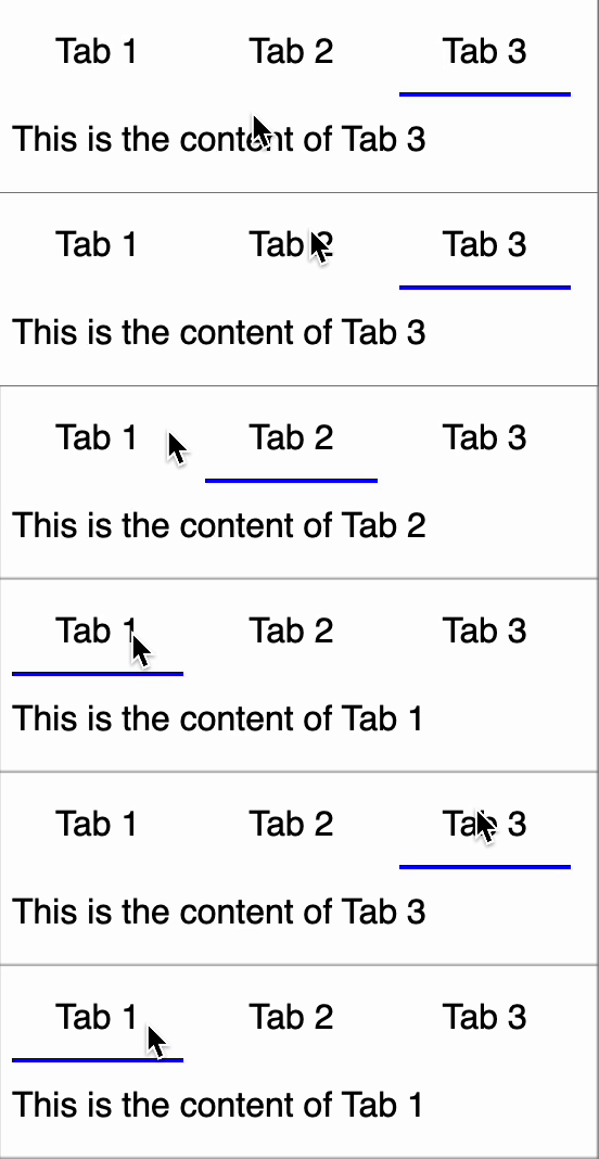
Implement a Tabs Component that allows users to switch between different tab content sections. Each tab should be clickable, and clicking on a tab should update the displayed content accordingly.
Requirements
- The component should accept a list of tabs as props.
- Each tab should have a
title and content.
- The first tab should be selected by default.
- Clicking on a tab should update the displayed content.
- The component should be reusable and scalable.
Constraints
- Constraint 1: The
tabs prop is an array of objects, each containing title and content.
- Constraint 2: Handle an empty
tabs array gracefully by displaying "No tabs available".
- Constraint 3: Handle cases where
title is missing in a tab by displaying "Tab 1", "Tab 2", according to the tab number.
- Constraint 4: Handle cases where
content is missing in a tab by displaying "No content available".
Reference UI