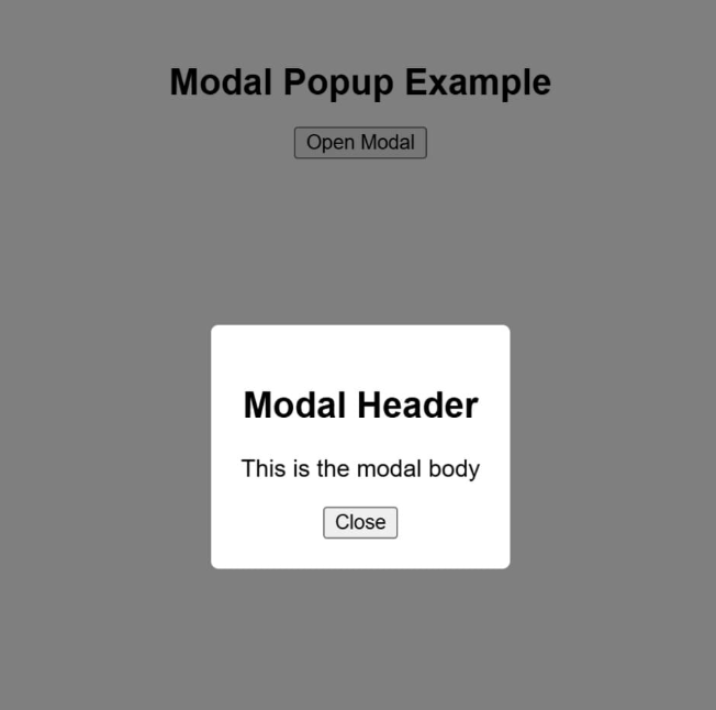
Create a simple, functional modal popup in React with clear open/close behavior. This component demonstrates UI state management with useState, conditional rendering, and handling user interactions such as clicking outside the modal or on the close button.
Component Details
You need to implement a Modal component that:
-
Displays a button labeled "Open Modal".
-
Opens the modal when the "Open Modal" button is clicked.
-
Displays modal content with the following:
- A heading: "Modal Header"
- A paragraph: "This is the modal body"
- A "Close" button inside the modal
-
Closes the modal when:
- The "Close" button is clicked
- The user clicks outside the modal (on the backdrop)
-
Does not close the modal when clicking inside the modal content
-
The outermost div that wraps the modal (when visible) must have data-testid="modal-backdrop" for testing.
Reference image